Two mums, and longtime friends, had been searching for a children’s healthy alternative to the mass-produced nut butters saturating the market.

However, Sarah and Katie couldn’t find any — these didn’t actually exist. So, they decided to make their own for their children. The homemade creations proved such a hit with their daughters that they decided to spread the joy further, producing a range of nut butters that would go into market.

They had a range of four nut butter flavours and a brand name. They came to me to create the identity and associated elements.

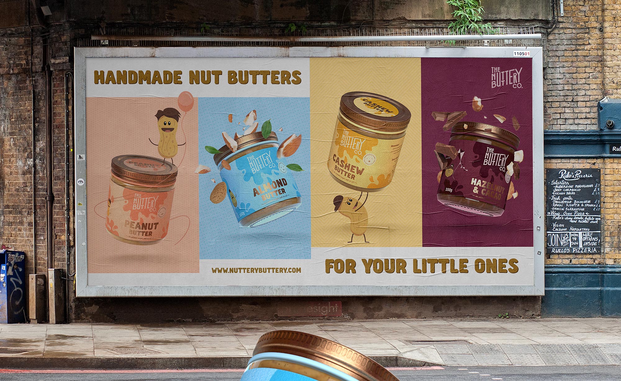
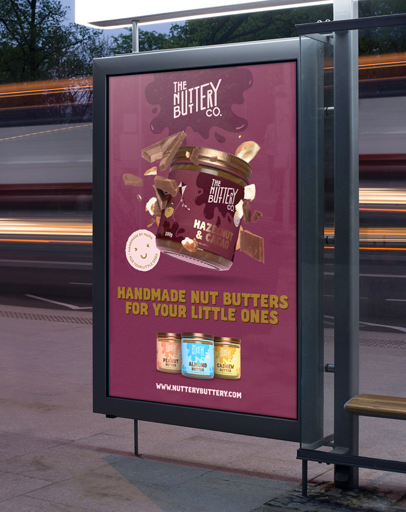
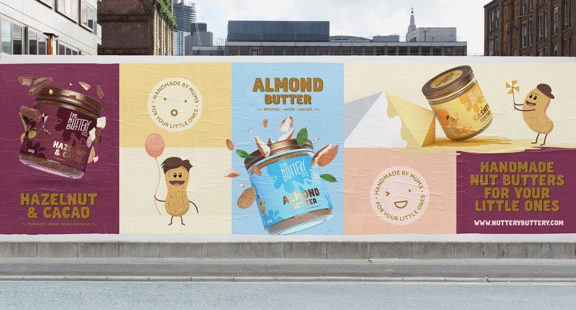
The products were made for children but we knew that the decision to purchase Nuttery Buttery or not would be their parents’. And this was the real challenge - to create an identity that was appealing to children and adults alike.

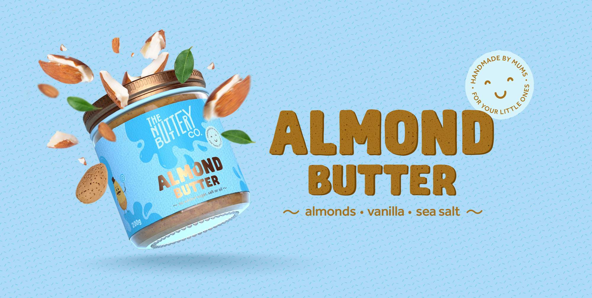
To help justify the range’s premium price point, the strategy was to create packaging that, on the one hand, delivered a reassuringly premium feel for parents whilst, on the other, incorporated child-based cues that youngsters could relate to and enjoy.

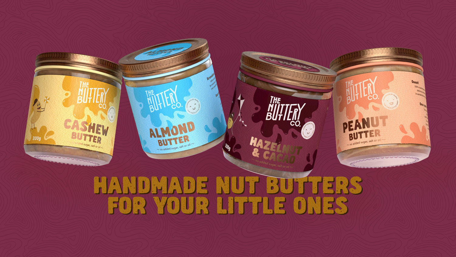
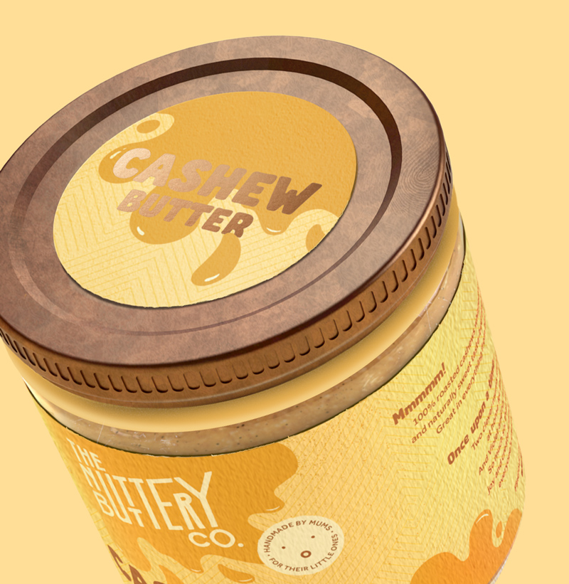
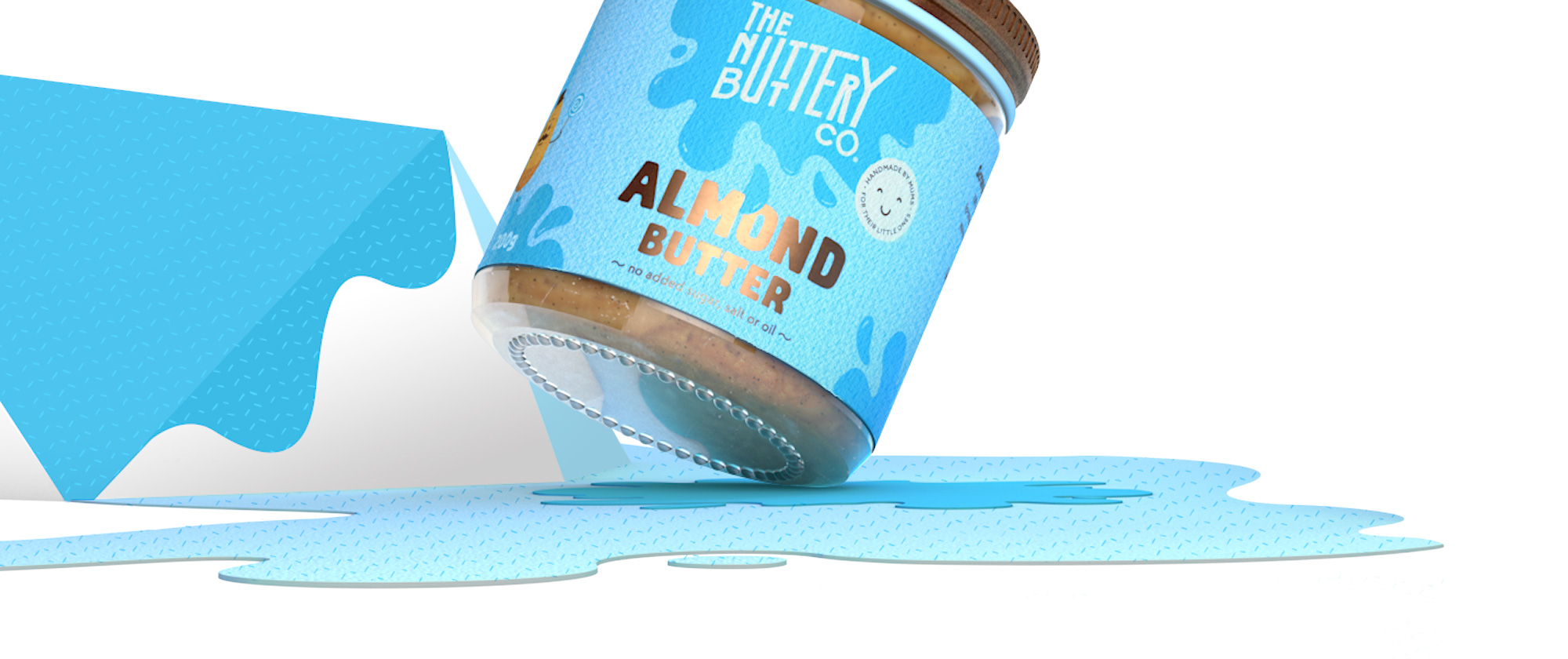
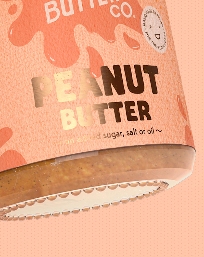
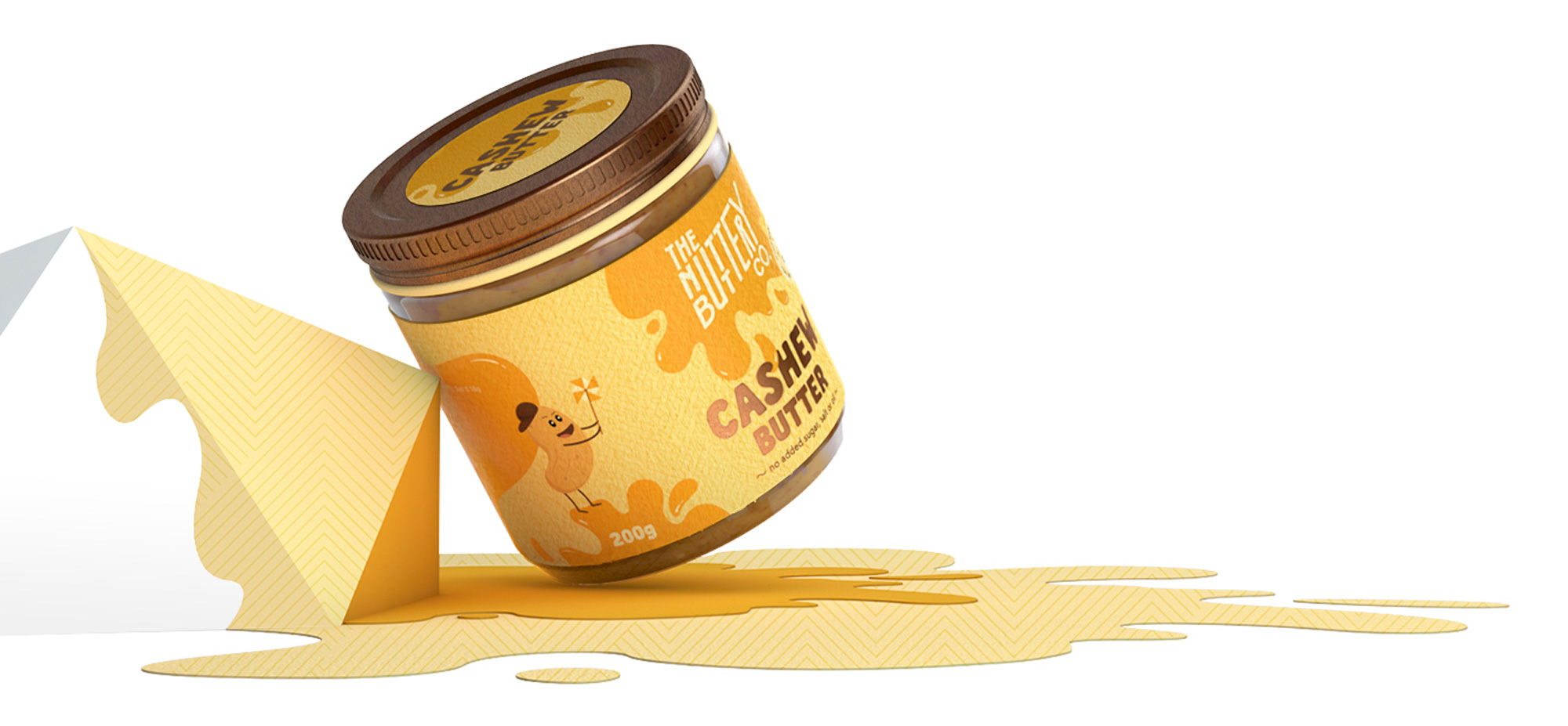
The logo itself was artisan in nature which was a nod towards the butters being handmade. Each flavour was given a roundel and associated character, based on the nut featured in that flavour. They formed a playful, differentiating element, aimed at children but loved by parents. Touches like the copper foil flavour descriptor gave the labels enhanced shelf presence and all-important stand out, while also ensuring the packaging visually delivered on the premium price point.

The design, textures and finishes combined to create a playful brand, full of personality, yet one that retained premium cues. The look and feel gave the product range an endearing quality that turned it into a collectable ‘family’ of products, which consumers felt compelled to collect.

“After identifying our target market, Sarah and I were completely overwhelmed with how to get the brand off the ground.”

Katie Coley, The Nuttery Buttery Co. joint founder approached me with simply an idea and brand name. Creating, shaping and steering all aspects of the brand from the ground up was a involved but hugely satisfying undertaking.
It started with the initial brand elements, such as the logo and flavour colour palettes. Then came creating the jar packaging and illustrating the nut characters. Finally, I built all the 3D assets that would feature across advertising.

At the time of writing the product is currently being sold in local health food stores, helped by print ads raising brand awareness seen around London when the brand was launched in Summer 2018.
Nuttery Buttery saw a 68% sales growth from launch to November 2019.

Project Details

Client: The Nuttery Buttery Co.
Category: Brand Identity  |  Packaging
Involvement: All
Agency: Personal Freelance   •   Year: 2018
Market Region: UK
Software: Illustrator  |  Cinema 4D  |  Photoshop