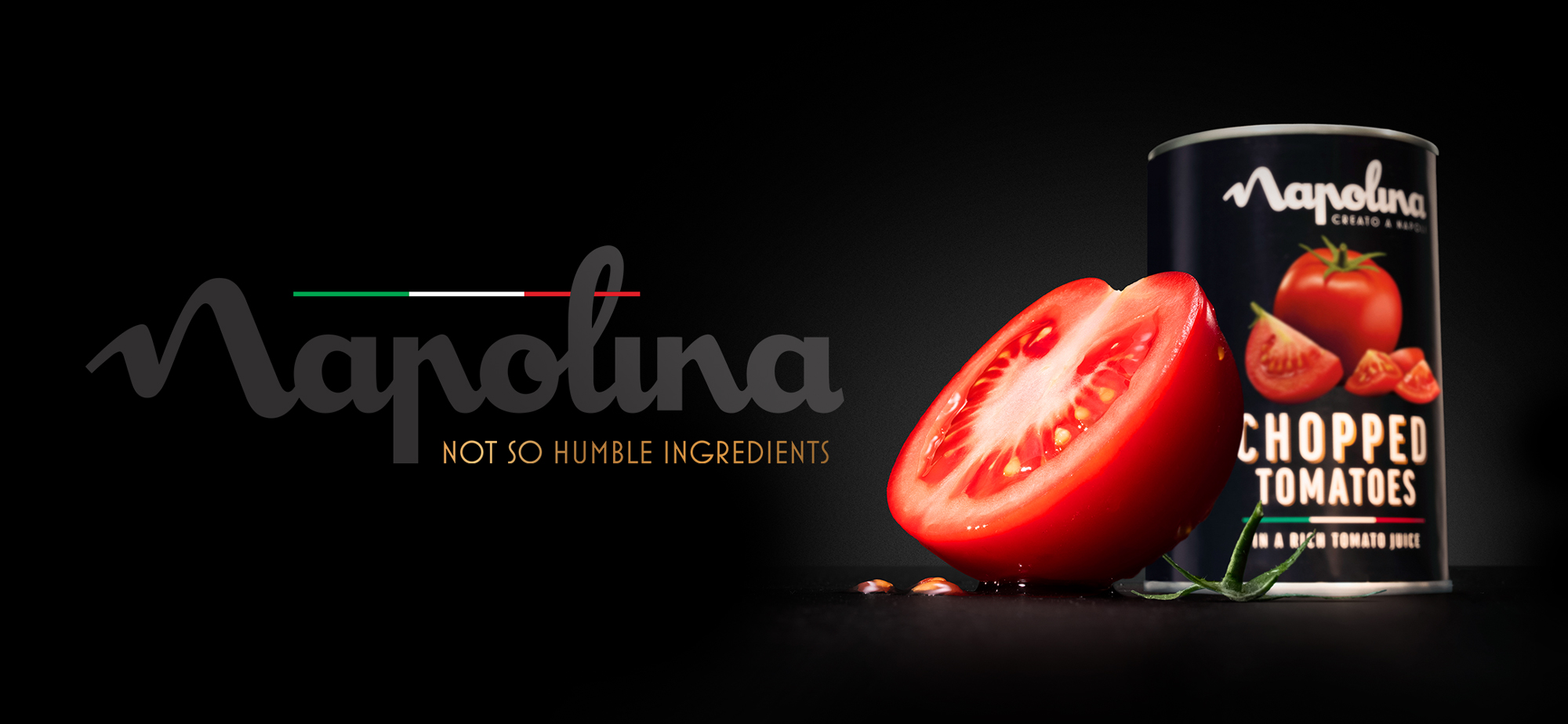
I was the sole designer on the team tasked with bringing Napolina’s next ad campaign to life. With over 140 delicious and quality products to celebrate, we wanted to put their authentic, premium ingredients front and centre, showcasing the Italian swagger behind the brand.
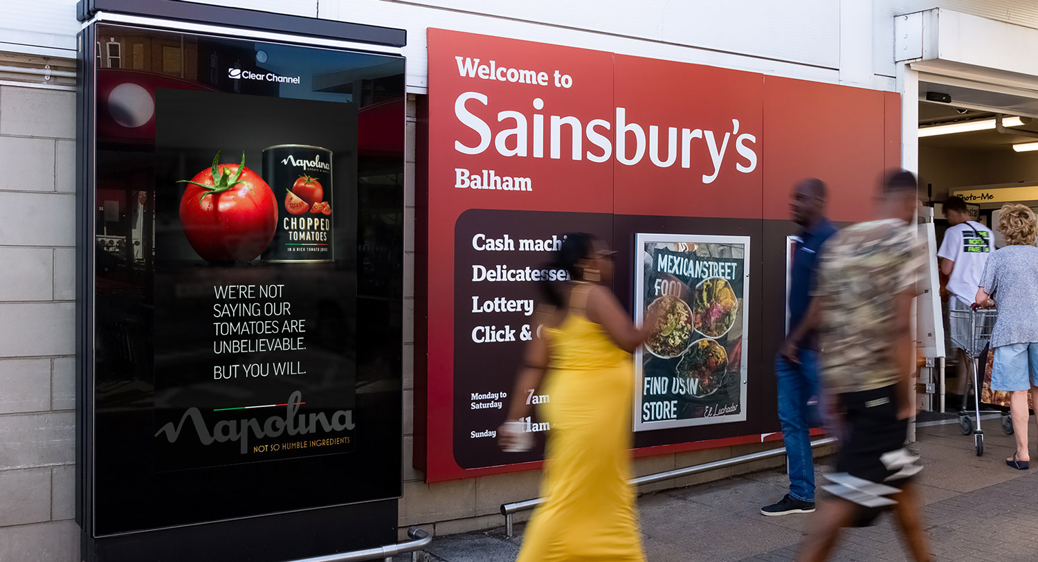
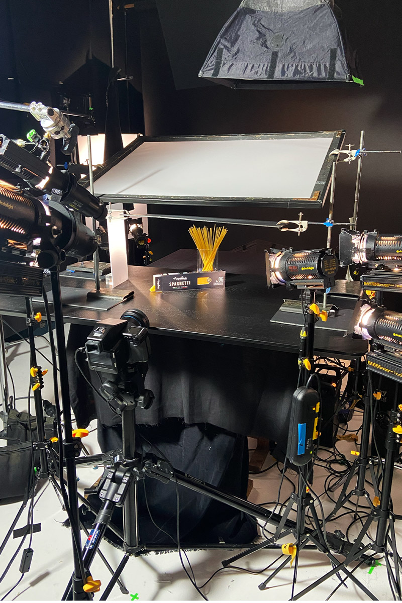
Once the campaign identity was designed, we had to shoot the ingredients and roll it out across numerous touchpoints.
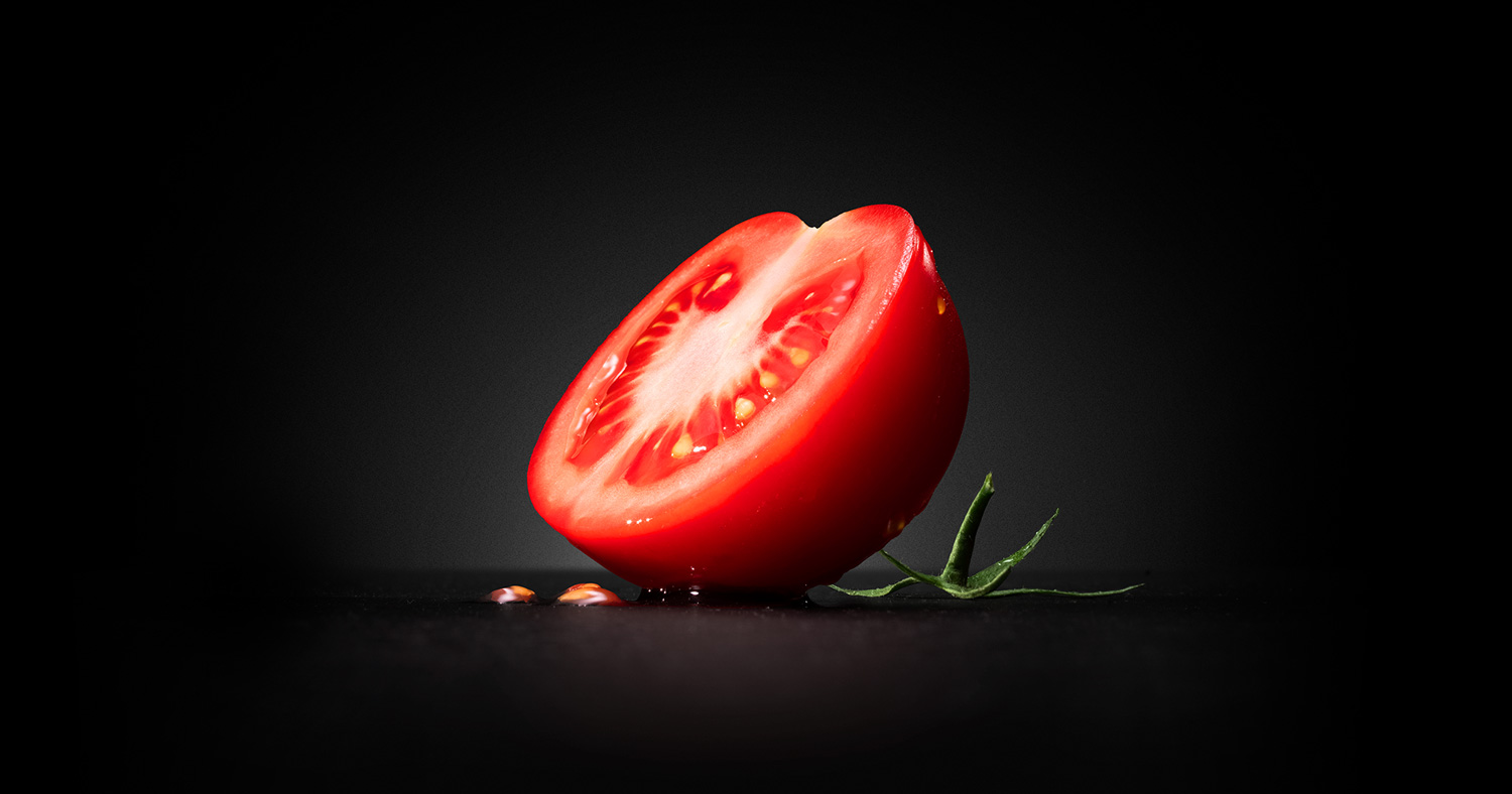
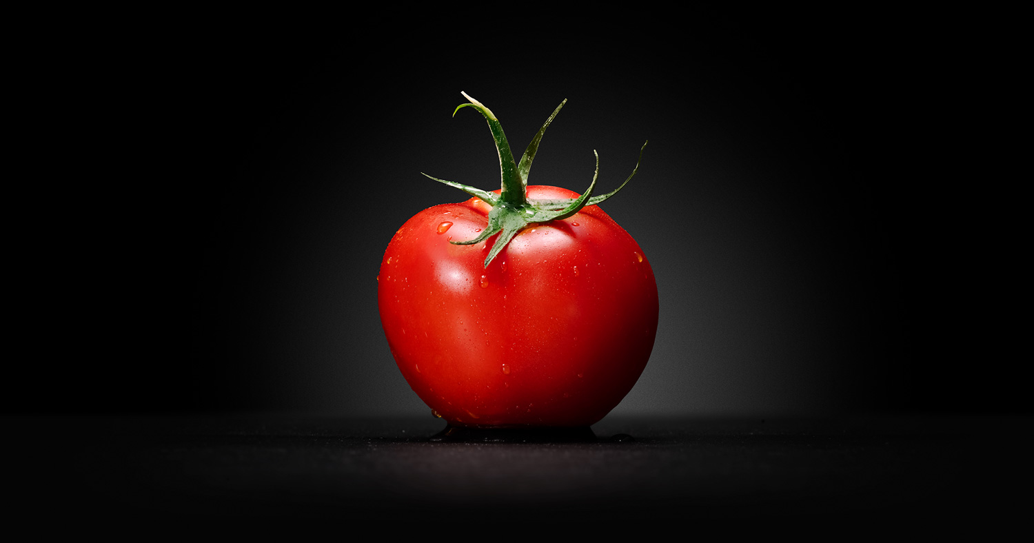
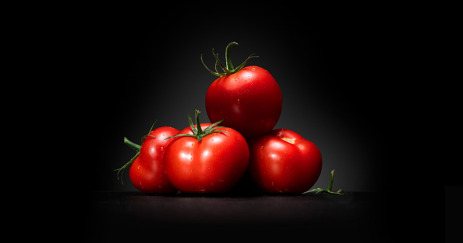
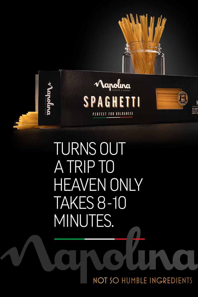
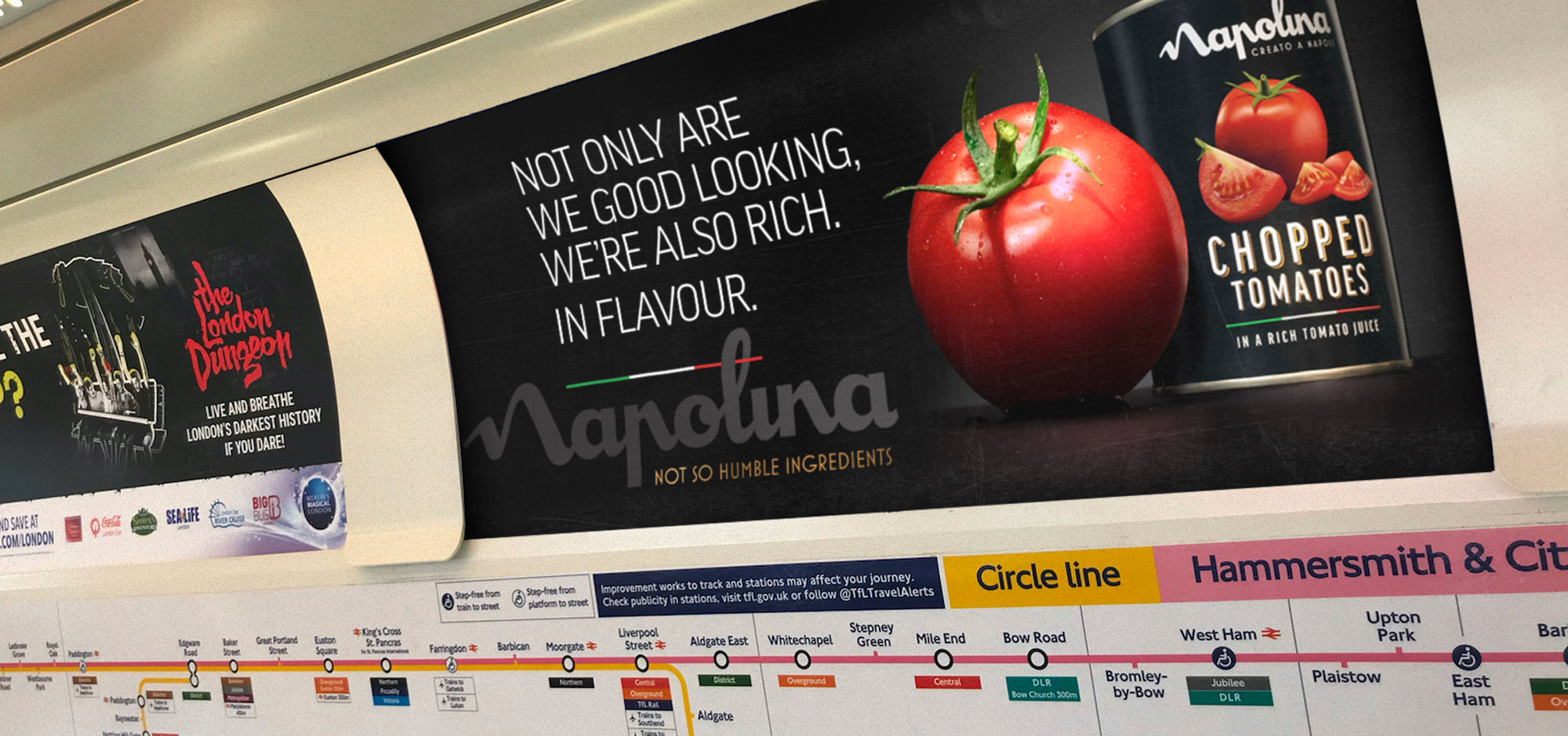
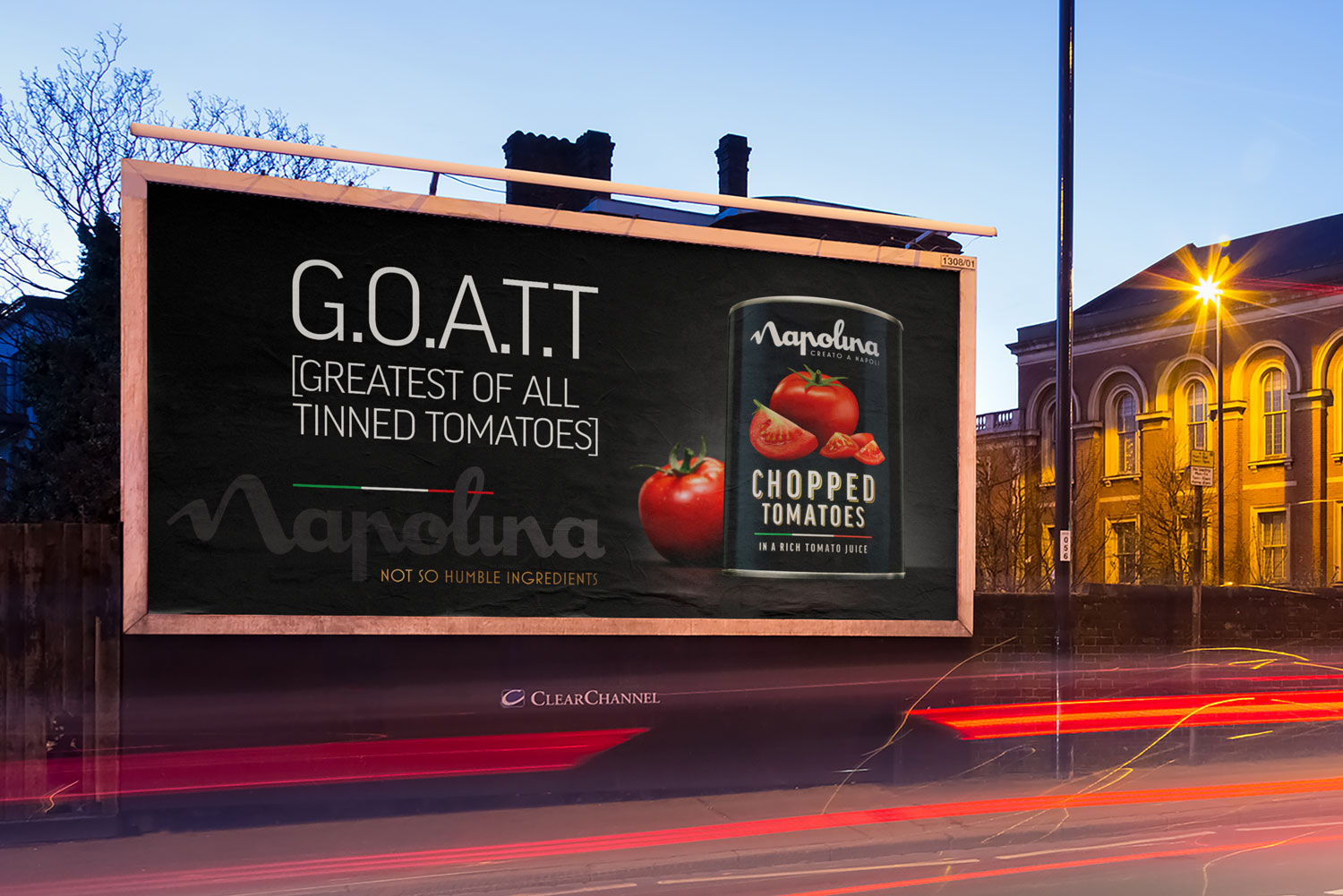
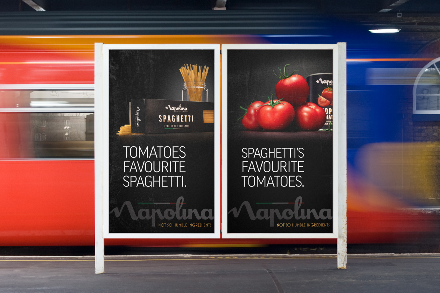
We wanted to shoot each ingredient from a low angle to make them appear heroic.
The low camera angle accentuated the ‘look-at-me’ stance - if the ingredients had hands, they’d be on their hips!
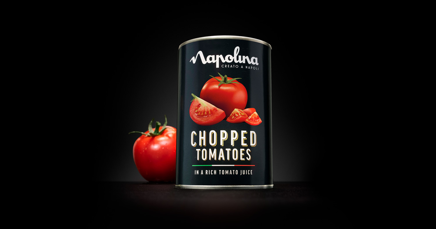
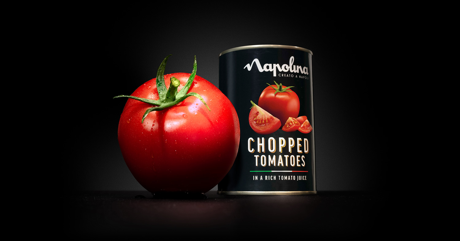
We put a lot of thought into how the ingredients were styled. A perfectly spherical tomato would look too unrealistic. So each tomato needed character — plump, juicy with a lively vibrant green top, looking like it had been ripped straight from the vine. Water droplets on the skin gave it a fresh feel, like it had been just washed under a tap.
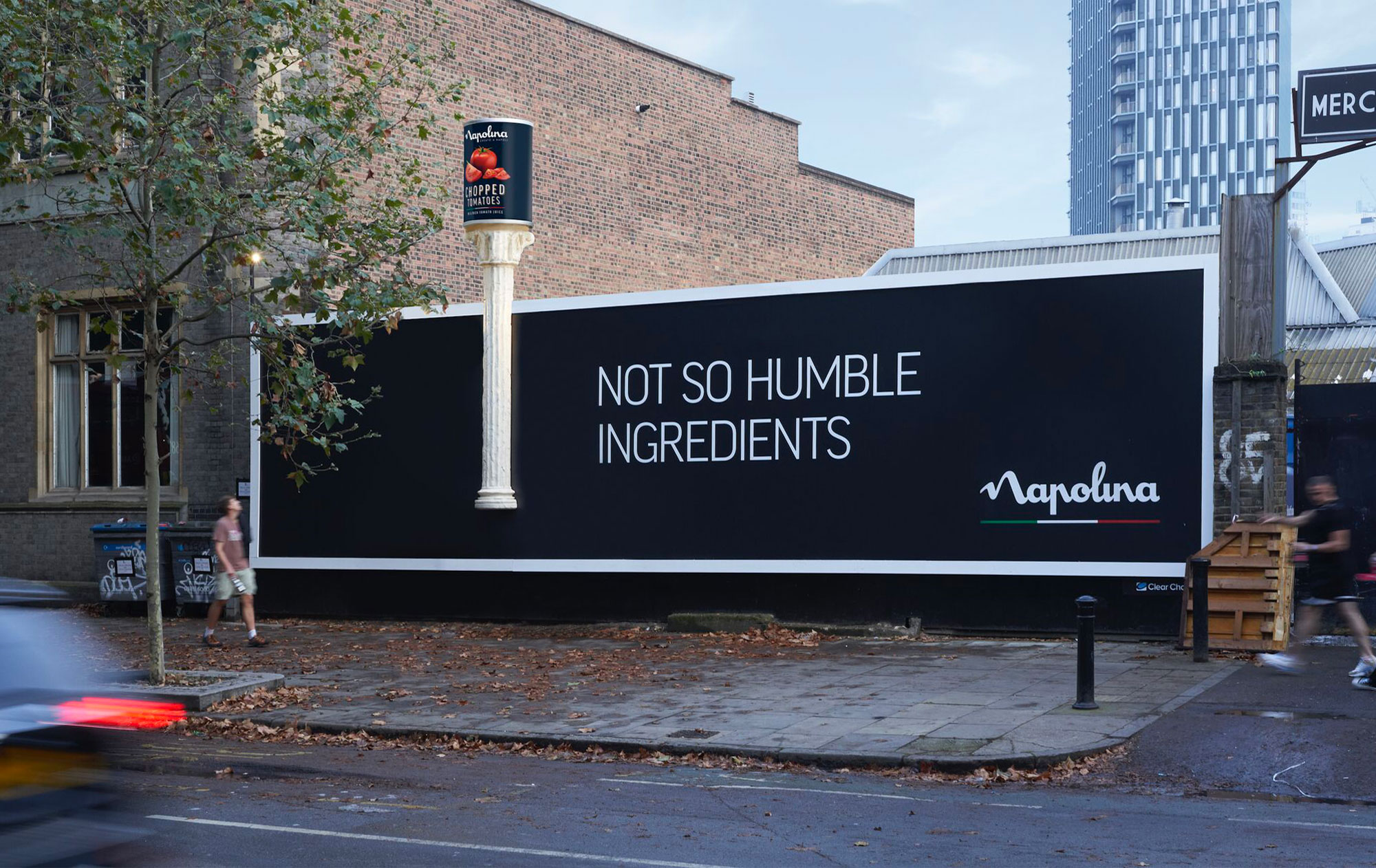
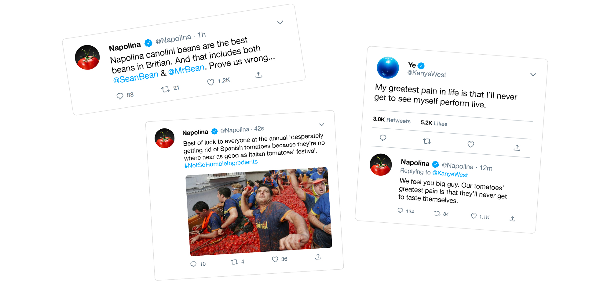
We wanted to bring hyperbole and humour to the busy and serious category. So our tone of voice was cheeky, full of a Mediterranean self-confidence, designed to stand out from the crowd and grab consumer’s attention.
We had to ensure headlines captured the confident Italian spirit but didn’t stray into an unlikeable ‘arrogant without reason’ space. To help with this, we made headlines quick to understand and tightly linked to the ingredients being heroed.
Competitors often leaned on their heritage too much, coming across as overly patriotic. But we felt Napolina could communicate their hertiage in more of a self-assured manner. This ‘we-know-we’re great-so-we-don’t-need-to-be-over-the-top’ confidence meant we didn’t need to yell, so the chosen typeface was considered but not shouty to tie in with the tone of voice approach.
“With economic pressure seeing people cutting back on eating out, consumers are looking for high-quality food when they eat in.”
Jeremy Gibson, Napolina marketing directer went on to say, “So, this is no time to be humble about the quality of our products. With this campaign, Lucky Generals has given Napolina a distinctive brand message and enabled the brand to stand out from the rest of the sector.”
Lucky Generals founding partner, Andy Nairn added: “Napolina’s tasty ingredients have been saving the nation from subpar mid-week dinners for decades.“We thought it was time we gave them a voice so they could demand the credit they deserve. And we had a lot of fun doing so.”
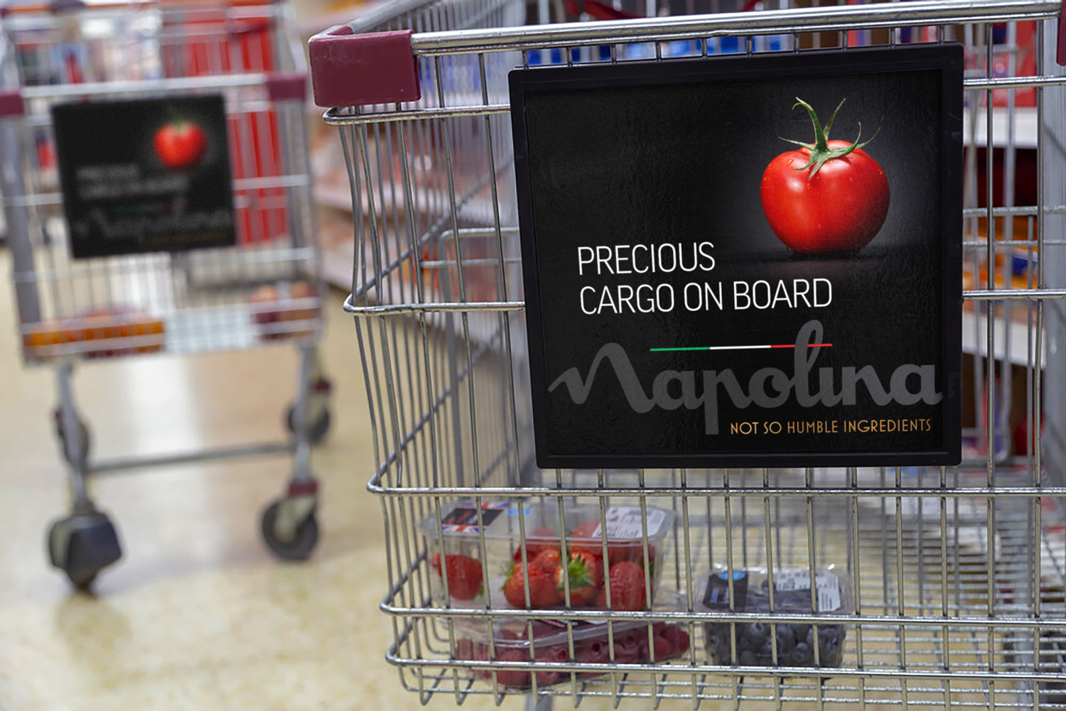
Napolina products aren’t made from your average ingredients, they’re precious gems, and they deserve to be treated as such.
So, in motion formats, we didn’t want to include flashy type or fun animations. These would simply distract from the hero ingredients. Instead we kept it straightforward, letting the ingredients shine by using lighting to add movement and drama. Light dances across the beads of water on a tomato’s skin, flares glint off the fine metal edge of a can — all of it adds to our not so humble ads.
Project Details
Client: Princes Group Category: Campaign | Shoot Involvement: Art Direction | Design | Rollout Agency: Lucky Generals • Year: 2022 Market Region: UK Photographer: Patrice De Villiers Software: Photoshop | InDesign