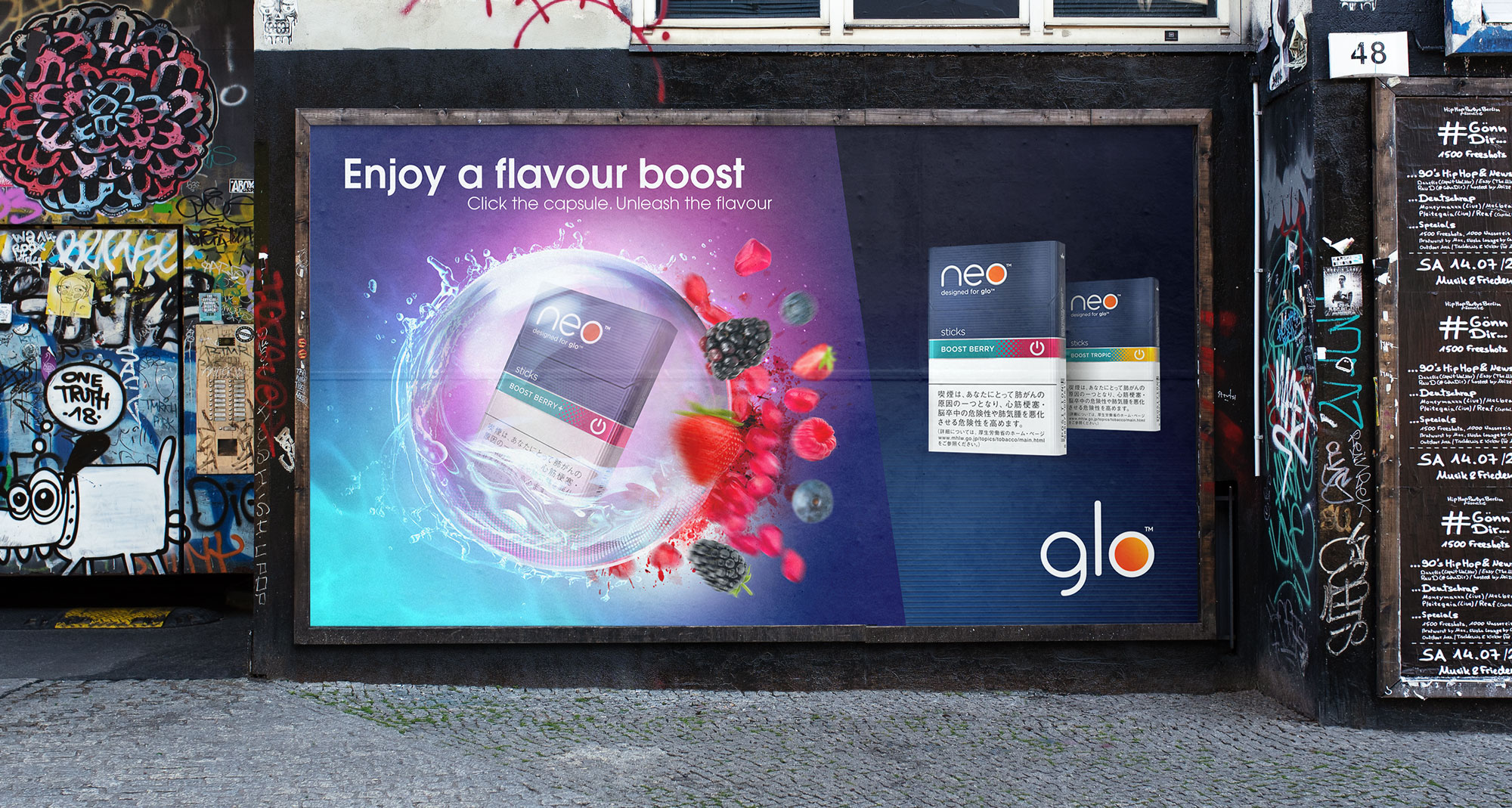
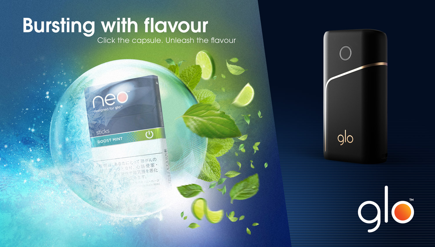
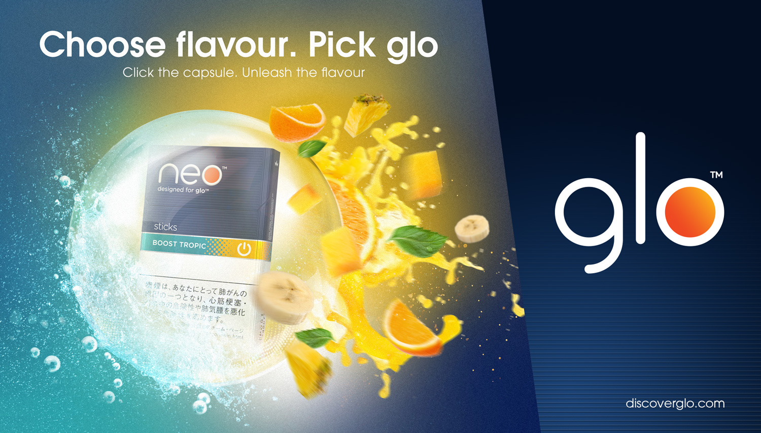
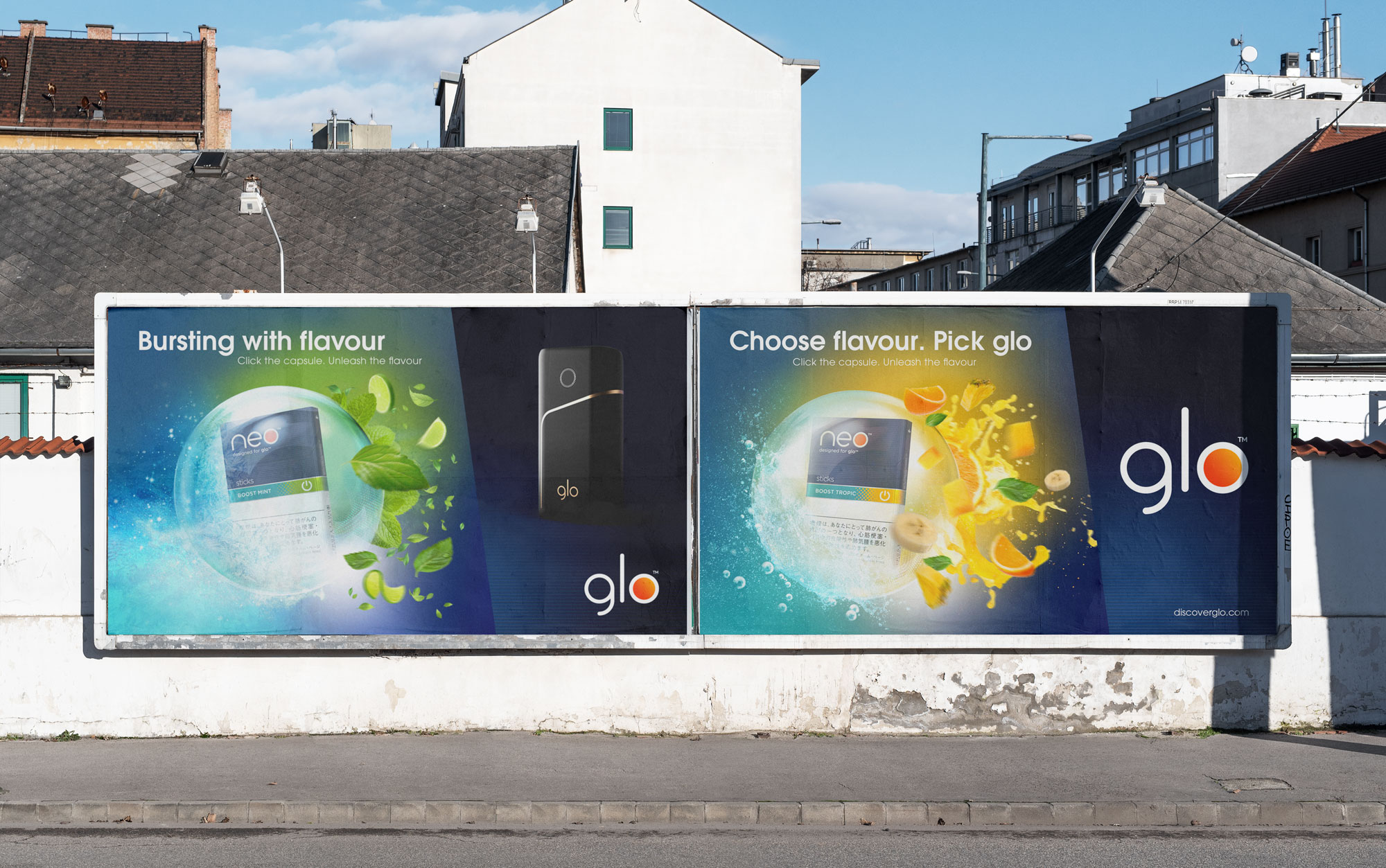
The client briefed us to move away from traditional, combustible-like comms to a more emotive, engaging, and disruptive visual language.
Neo capsules were [at the time of the campaign] a Glo exclusive feature and therefore a great opportunity to drive growth both from traditional combustibles users and competitors.
The result was a suite of key visuals that disrupted the conventional look and feel of the category while effectively communicating the capsule nature of the product.
Developing the visual language
As the only designer working on the campaign, I created and crafted the visual language which focused on heroing the capsule. Placing the pack inside it hinted at the lighter taste of the new product. Using treatment around the capsule (such as the ice frosting, water spray etc) we obscured the health warning, further pushing it away from the traditional combustibles look and feel.
The treatment of flavour cues (fruits chunks etc) reinforced and emphasised the exclusivity of the Neo capsule within the market.
Project Details
Client: British American Tobacco (B.A.T) Category: Campaign Involvement: Art Direction | Design Agency: Geometry Global • Year: 2019 Market Region: Romania Software: Photoshop